
ROCA Accountants
ROCA Accountants are a growing accountancy firm with a clear ambition: attract and work with larger, more established clients. While their services and expertise were already at that level, their website didn’t reflect it. First impressions matter and they needed a site that positioned them as confident, capable, and professional from the moment a visitor landed.
The Challenge
ROCA’s existing website wasn’t doing their business justice.
It didn’t clearly signal that they could handle bigger clients, and enquiries often lacked context due to a single generic contact form. This meant extra back-and-forth just to understand what a prospect was actually getting in touch about.
They needed a website that:
-
Looked credible and professional enough to attract larger businesses
-
Clearly communicated their different services
-
Made enquiries more intentional and easier to handle internally
-
Encouraged direct contact at any point in the journey
Our Strategy
Rather than overcomplicating things, we focused on clarity, structure, and confidence.
The goal wasn’t just to “refresh” the website – it was to reposition ROCA Accountants.
We started with multiple design directions to ensure the final site aligned with their vision. Three initial concepts were produced, and one immediately stood out. That direction became the foundation for the full build, allowing the project to move quickly and decisively.
Every design choice was made to signal professionalism, trust, and scale.
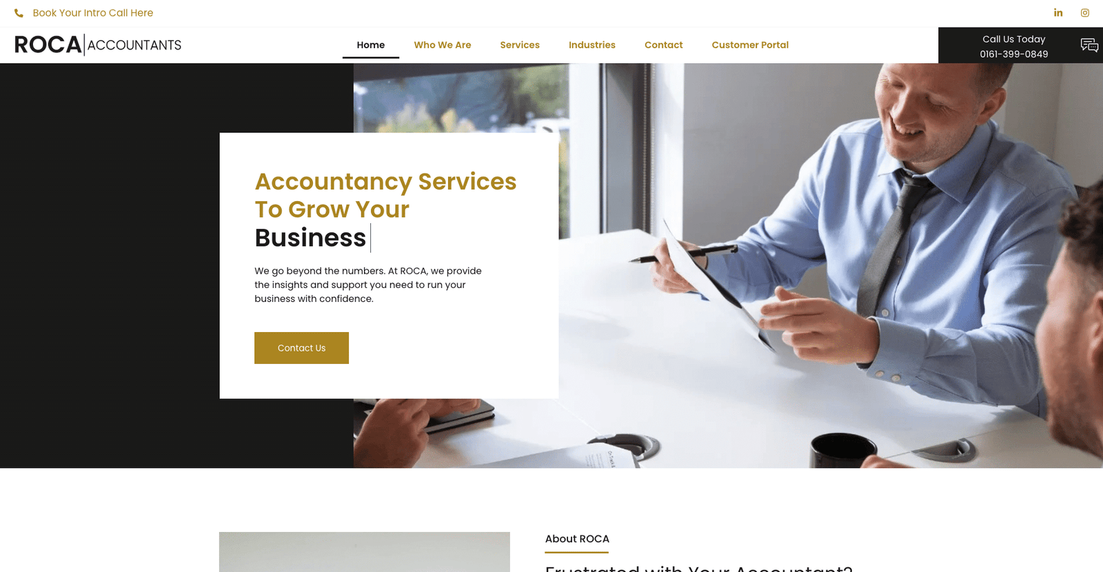
The System We Built
The website was designed as a conversion-focused business tool, not just a brochure.
Key elements included:
-
A professionally designed layout to reflect a firm capable of handling larger, more complex clients
-
Dedicated service pages, each with its own contact form – so every enquiry comes in with clear intent
-
A clear site structure that makes it easy for visitors to find the service relevant to them
-
A floating “Call Us” button that stays visible across the site, allowing visitors to phone instantly at any point
This meant ROCA could immediately see what a prospect was enquiring about and respond more efficiently, while also capturing higher-quality leads.
Why It Worked
This approach worked because it removed friction for both sides.
Prospective clients:
-
Instantly understood ROCA’s professionalism
-
Felt confident they were dealing with a firm suited to their size
-
Could enquire or call at the exact moment they were ready
ROCA:
-
Received clearer, better-qualified enquiries
-
Spent less time clarifying intent
-
Presented a stronger first impression to higher-value prospects
The site didn’t shout. It simply did what it needed to do – quietly position ROCA at the right level.
The Outcome
ROCA Accountants now have a website that:
-
Reflects the scale and quality of clients they want to work with
-
Captures more intentional, service-specific enquiries
-
Encourages direct contact through a prominent floating call button
-
Supports growth without needing constant explanation or follow-up
It’s a site designed to grow with the business – not hold it back.
Final Thoughts
A website isn’t just about looking good.
It’s about sending the right signal to the right client.
For ROCA Accountants, this meant moving away from a generic online presence and towards a site that confidently supports their next stage of growth.
If you want your website to attract better clients – not just more traffic – this is the level you should be building at.